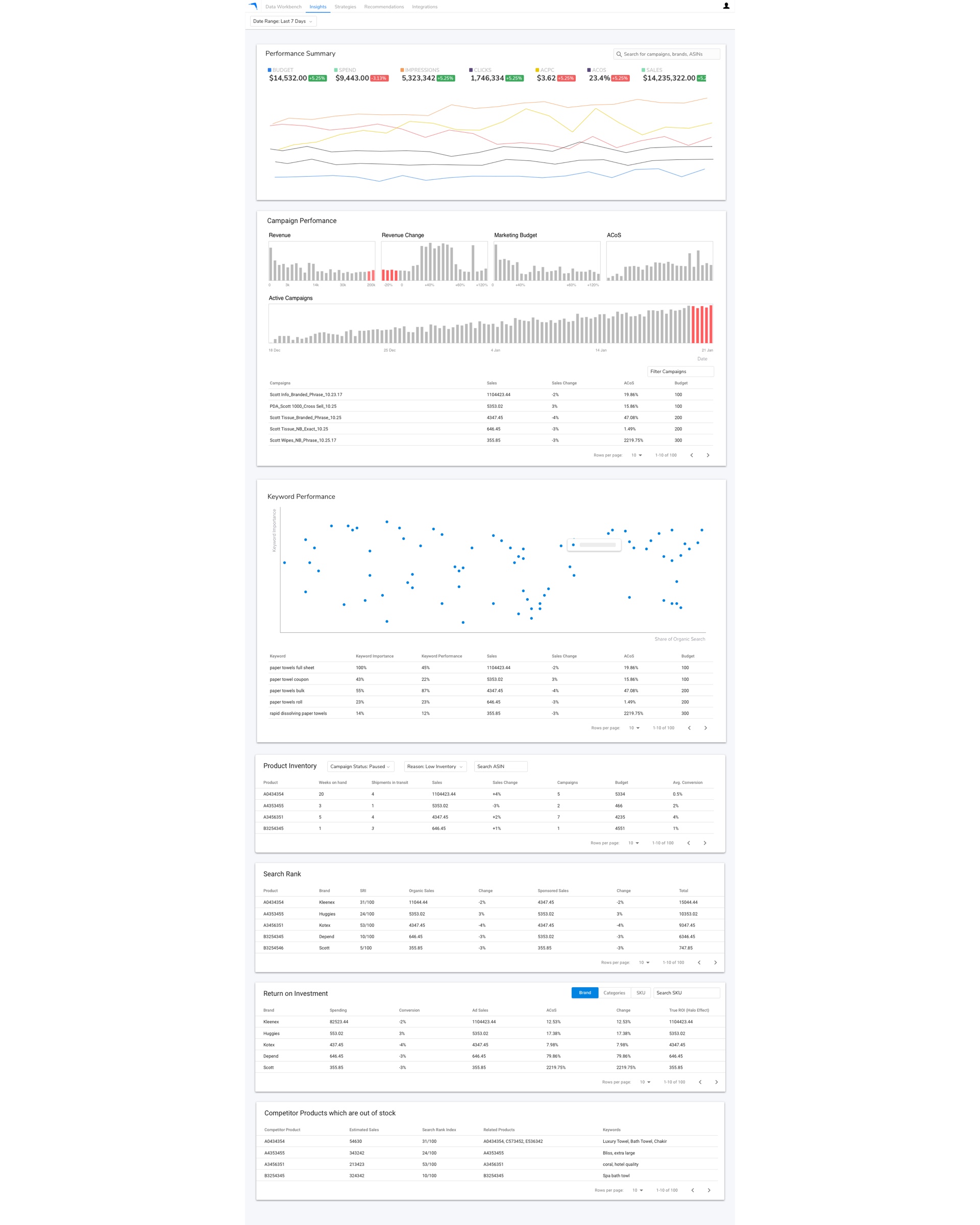
Aramus is a new product under development, and its aim is to help Sales and Marketing teams in brands that list and sell their products on Amazon. It offers Ecommerce merchants a number of tools they can leverage to be successful on Amazon, such as search rank tracking, ad automation and campaign optimization.
Design Role
- User research with Ecommerce merchants
- User testing of new designs
- Prototype creation
- Prototype testing
- Design of UI
- Recording and transcribing user interviews
Additional contributions
- Implemented the UI for the prototype
- Mentored a junior designer
- Developed standards for workflow & file delivery
- Proposed and help implement Airtable to increase speed of iteration
- Implemented and evangelized internal UI library
Problem
We needed to rapidly design, build and iterate on prototypes so the sales team could pitch and sign our first customers as quickly as possible and outdo our competition.
Constraints
- Rest of the team was in India including the Product Manager and the engineering team, with little time overlap.
- Extremely broad scope that was rapidly evolving
- Lack of first-hand exposure to potential users
- Urgency in entering the market
- No HTML/CSS developer on the team
Process
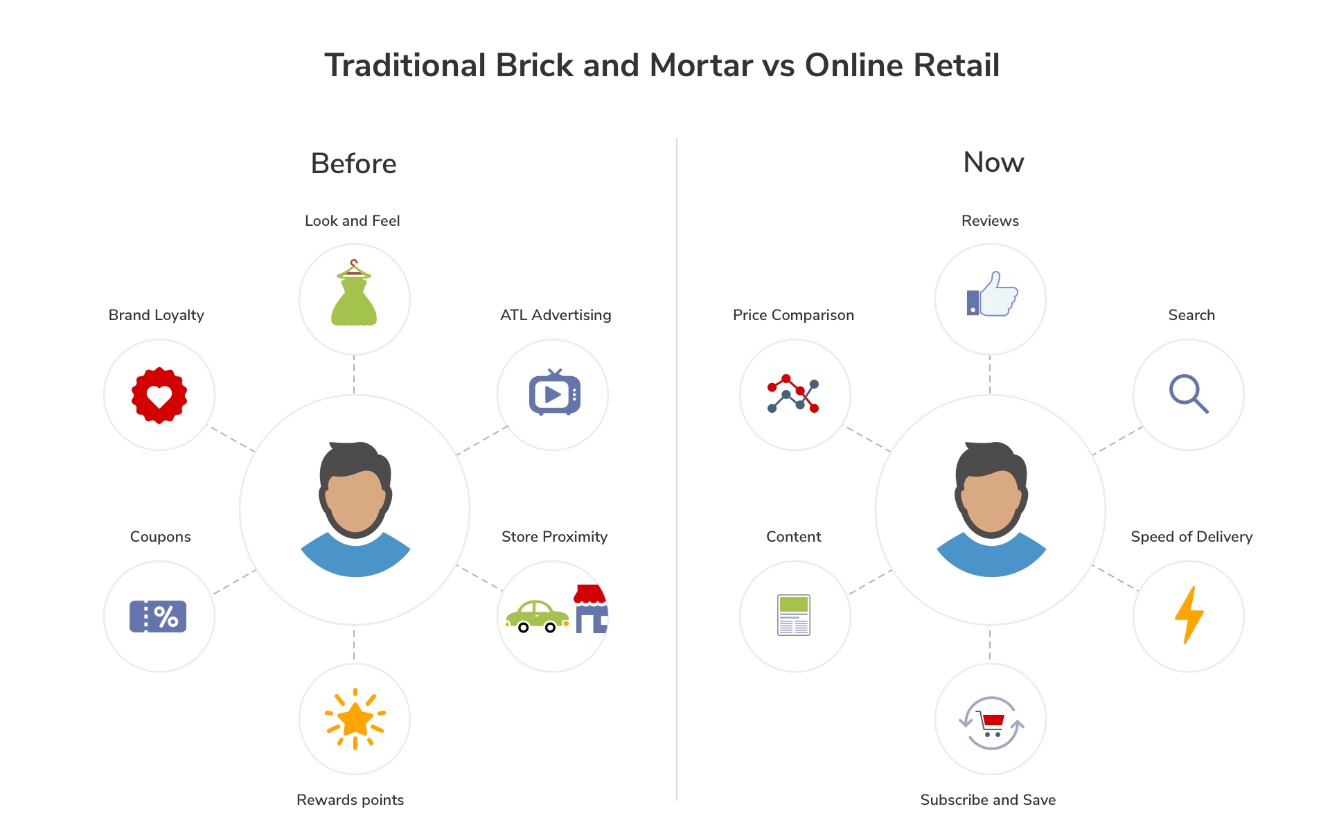
We were building a product for a space foreign to us, so the highest priority was to quickly achieve a high-level understanding about the space and explore in depth the areas we wanted to focus on. For these areas, we wanted to do sufficient validation so we could feel comfortable about the value we would be delivering to our customers.
However, being an outsider to the space, prospects are not incentivized to spend time and resources to help us gain an intimate understanding of their problems. As a workaround, we hired consultants who help brands manage Ecommerce operations and used them as a proxy.
Over two months, I led more than 10 interviews with them in an attempt to better understand their problems, and validated our hypotheses via prototypes of varying details and fidelities. Once the team felt comfortable about the overall scope, we started testing realistic prototypes in sales settings.
The team ran a tight schedule, sometimes having up to three demos a week, each requiring a custom set of data, which is significant for a product heavy on analytics. After each demo, we would regroup incorporate learnings for the next session.
MVP Design Approach
At this stage of product development, the main objective was to quickly express a strong opinion on value, in a way that we could at the same time be responsive to feedback. To facilitate that, design should refrain from being opinioniated until we had made several brands successful.
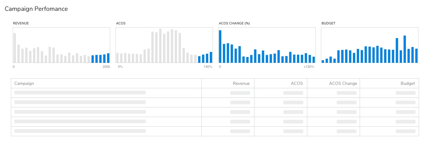
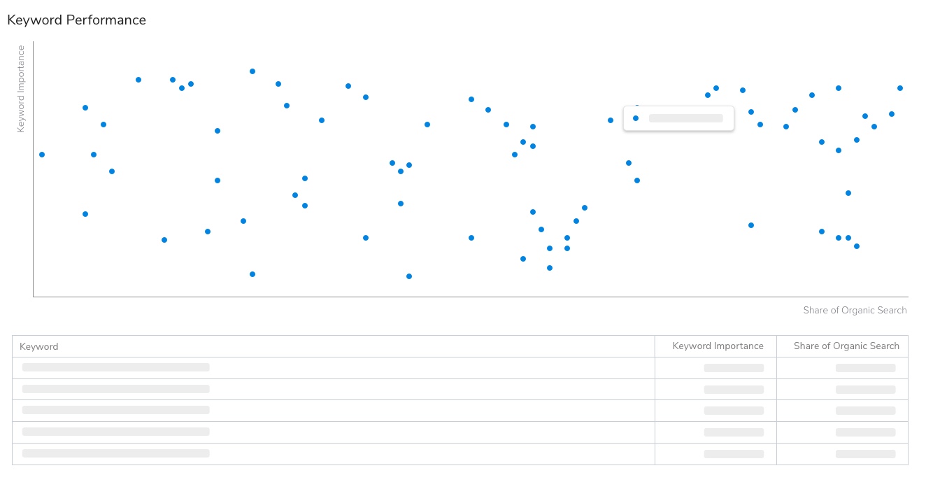
Therefore, instead of investing time to create polished UI, I created a library of generic and reusable components that could be used to compose screens with varying functionality. This also served a secondary purpose of giving a consistent look and feel across the product.
Leveraging established design patterns
A key feature that we wanted to highlight was the recommendations feature, which passively identifies large revenue risks and opportunities and suggests recommended actions, allowing merchants to take high value actions with less time and effort.

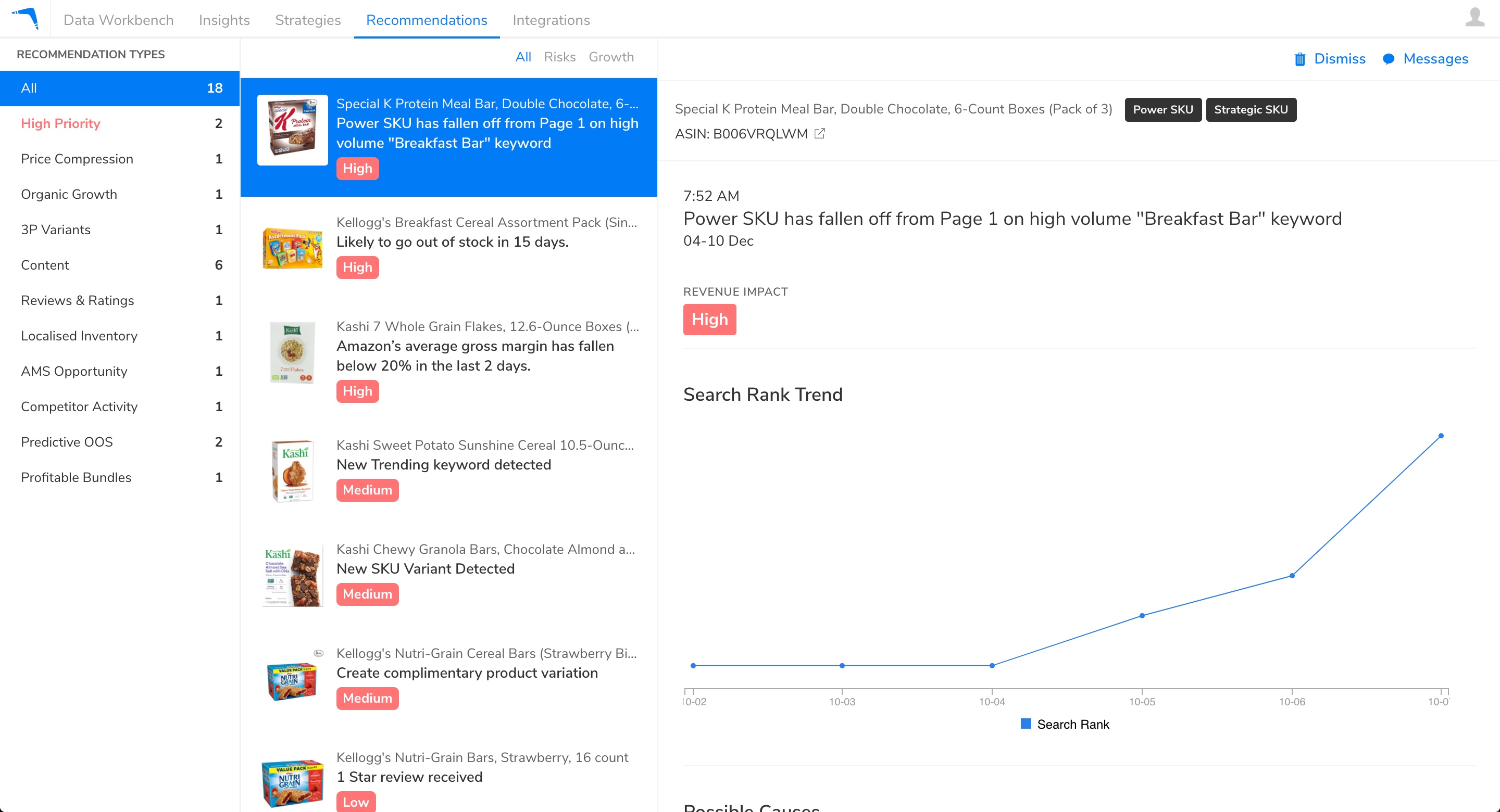
I considered that in a sales setting, it is crucial that our target audience understand the interface immediately with minimal explanation. In my design, I leveraged the design and interaction patterns associated with an email application, such as Microsoft Outlook and Apple Mail, which most if not all business users are familiar with. It included a master/detail screen pattern, and I framed other actions in a way they could draw parallels with in email, such as the ability to remove (dismiss) and share (message) the recommendation.
Building a Data-heavy Prototype
Realistic-looking data is crucial in a data-heavy application. The people that we show the demo to are extremely familiar with their business, and are highly sensitive to the content that they see in the prototype. It not only has to look real, but also be specific to their business and use cases.
In addition, because we needed to be doing multiple demos a week, we needed hundreds of data points to be populated within 1-2 days, while being able to do small adjustments and have them reflect in the UI immediately.
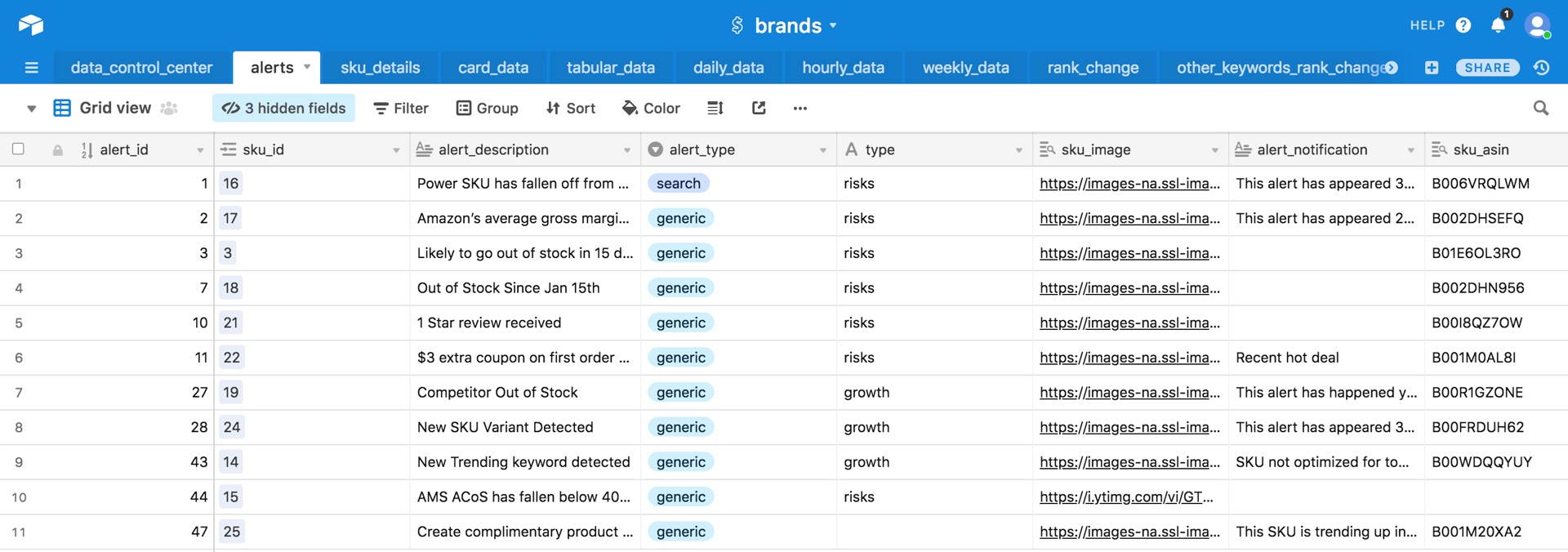
Anticipating this, I proposed that all dynamic content should be drawn from an external source which the sales team had control over. Previously, I had come across Airtable and felt it was ideal for our prototyping needs. It has a spreadsheet interface that the sales team was familiar with, and was relatively easily to implement.
Accelerating Development with Boomerang UI
Given that we didn't have any HTML/CSS developers on the team and that we were under time pressure, I suggested that we could accelerate development if we had a library of UI components, along with sample code that the developers could leverage to quickly populate the views without the need for detailed UI specifications. This way, I could control the look and feel of components in a single location.
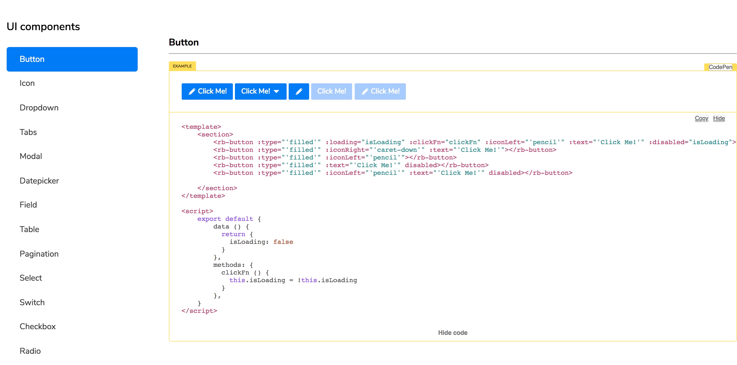
However building a UI documentation system is not a trivial task. Instead, I opted to take Buefy, an existing open-source UI library, and replace or modify its components to fit our needs. With this approach, we were able to have a rudimentary but functional UI library in two days, as opposed to several weeks had we built it from scratch.
With this approach, the team was able to field compelling demos to multiple prospects each week and incorporating prior learnings in the subsequent iterations, increasing the speed of finding product-market fit. The team has managed to sign some deals and the initial version is now being developed.
Additional work
