Users of PPM (Pricing Performance Management) are merchants and pricing analysts at large retailers like Lowe’s or Petco. Merchants are responsible for growing the bottom-line of one or several product categories, while pricing analysts assist with creation and diagnostics of pricing strategies.
PPM enables retailers to set and measure competitive prices.
Summary
I joined Boomerang soon after PPM was launched and one of my goals was to identify and address barriers to adoption. At the time, we had early adopters who were using the product heavily, but adoption was generally low across other customers. Through customer calls and onsite visits, we identified a number of issues which we attempted to address. Here I will talk about one of them.
During this time, we also received a RFP (Request for Proposal), and needed to perform a demo for a prospect at short notice. The leadership challenged the team to address some of these usability issues and showcase a prototype of the alerts feature in the upcoming demo.
Design Role
- User Research with merchants and pricing analysts
- User testing of new designs
- On-site visits
- Prototype creation
- Redesign of UI (for RFP)
- Designed UI of Alerts feature
Additional contributions
- Implemented utility-first SASS framework
- Implemented the UI redesign
Problem
Merchants are using the product matrix frequently as part of their diagnostic workflow, but having to repeatedly scroll to the end of the page to get to it is tedious. The product matrix is also not efficiently utilitized, and has a lot of unnecessary clutter.
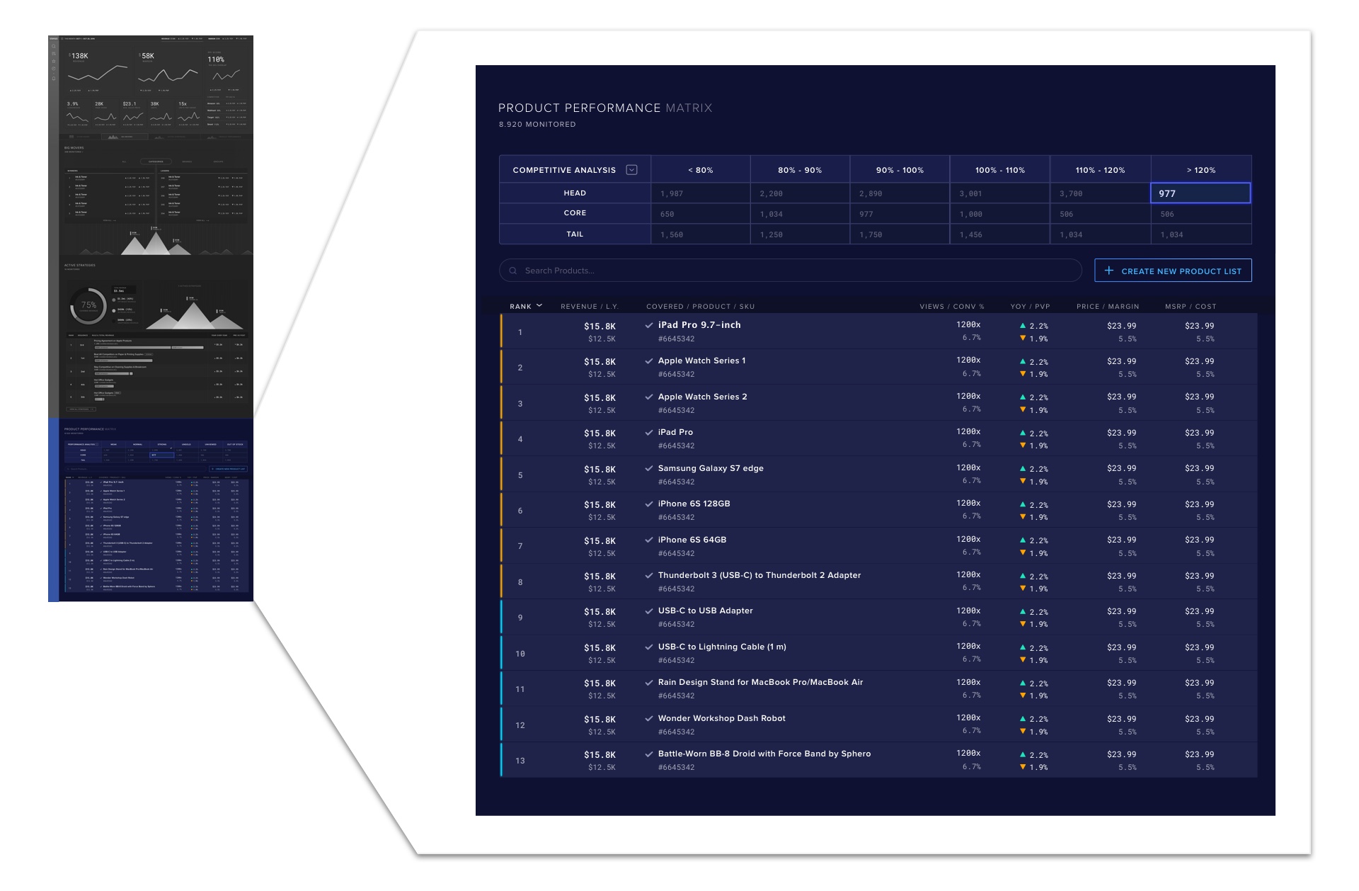
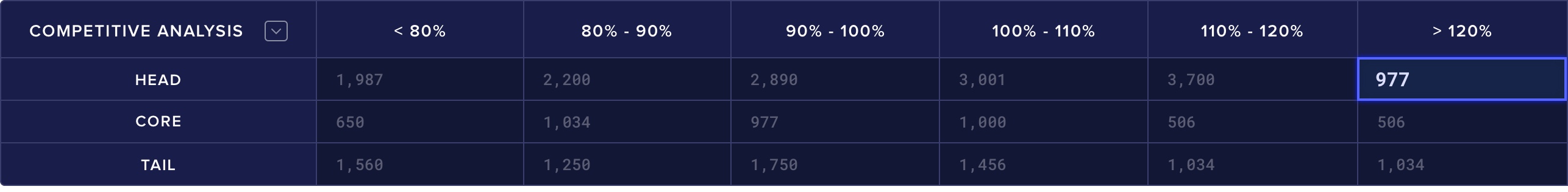
The product matrix is a 2x2 matrix showing how their category is distributed across revenue, split into Head (top 33%), Core (middle 33%), Tail (bottom 33%) buckets and another metric such as PPI (Price Performance Index), which is a measure of how price competitive their categories are relative to other retailers.
The product matrix allows a merchant to quickly identify highly visible SKUs that are priced uncompetitively. However in the initial design, most of the cells in the matrix were not used, since the highest priority for merchants is to identify the worst performing SKUs since they are the ones that require urgent attention. The team also wanted to present data-science driven opportunities in the near future that were more fluid and therefore would not fit well in the current structure. The accompanying table is also extremely cluttered because many data points were forced to fit in a small area, and the grouping of columns made it harder to parse the data since the relationship between rows and columns are made more complex.
Constraints
- Remote engineering team in India with little time overlap
- Outdated code, no CSS pre-processors
- No HTML/CSS developer on the team
Research
We did a number of calls with some of our early adopters, and also made trips to their offices so we could meet in person to better understand the problem. One of the early issues that surfaced repeatedly from these conversations was that during the process of diagnostics, they would frequently have to access SKU level information. For instance, if they saw that the products of their category was priced much higher than on Amazon, they would want to see which of those products were responsible so they could either change the price manually or add that SKU to a pricing strategy. In our logs, we saw that SKU level access was among the most frequent action our users took, which corroborated these anecdotal evidence.
Design
To address this issue, I proposed using a tab for users to get to the product matrix. While there were several options. I decided on tabs because it is a commonly used way to display alternative views with different use cases while maintaining the same context. I positioned it as part of the header so it could be persistent regardless of where the user is looking at on the dashboard. The team also planned to include additional views to diagnose performance issues such as root cause analysis and trend analysis, so tabs would communicate that structure than say, a button or a toggle in this instance.
For the product matrix, I proposed that we move away from a 2x2 matrix and use a list instead, since that would allow us to have more flexibility to display only what was relevant for our users. The team had been brainstorming about ways to surface advanced thematic opportunities which were more fluid, driven by data-science and wanted to present that in an upcoming demo. A list would also support that better than the current matrix.
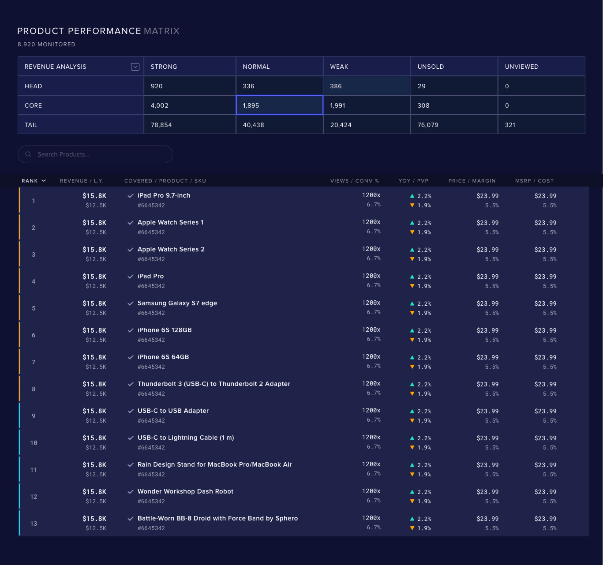
Lastly, the table under the product matrix looks extremely cluttered, in large part due to the number of data points forced to fit in a small area. In this arrangement, it would have been tricky to allow the user to sort by a certain value, which an interaction that many of our users would have taken for granted coming from a history of using spreadsheets in their work. The solution I proposed was to remove the data points except the ones that were relevant in the current context, which made the information much easier to parse.
Since this was a relatively small change, we had a tight deadline and little UI engineering support, I decided to skip the wireframing and mockup stage and make the UI adjustments in code.
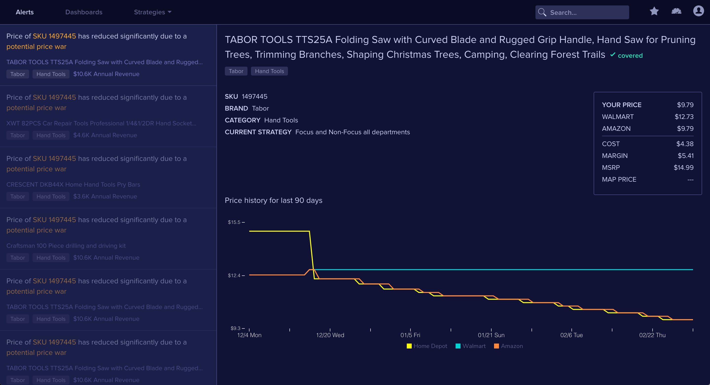
We were able to include these changes and also present a prototype of the alerts feature, which allow merchants to manage their categories via exceptions. Being able to demo this helped distance us from our competitors and enable the sales team to secure several landmark deals. In addition, as a result of these changes and other feature improvements, product adoption across our customers have increased significantly.